Uccello
Studio: Freelance
Team: Eleanor Robertson
Credits: —
Date: 2020

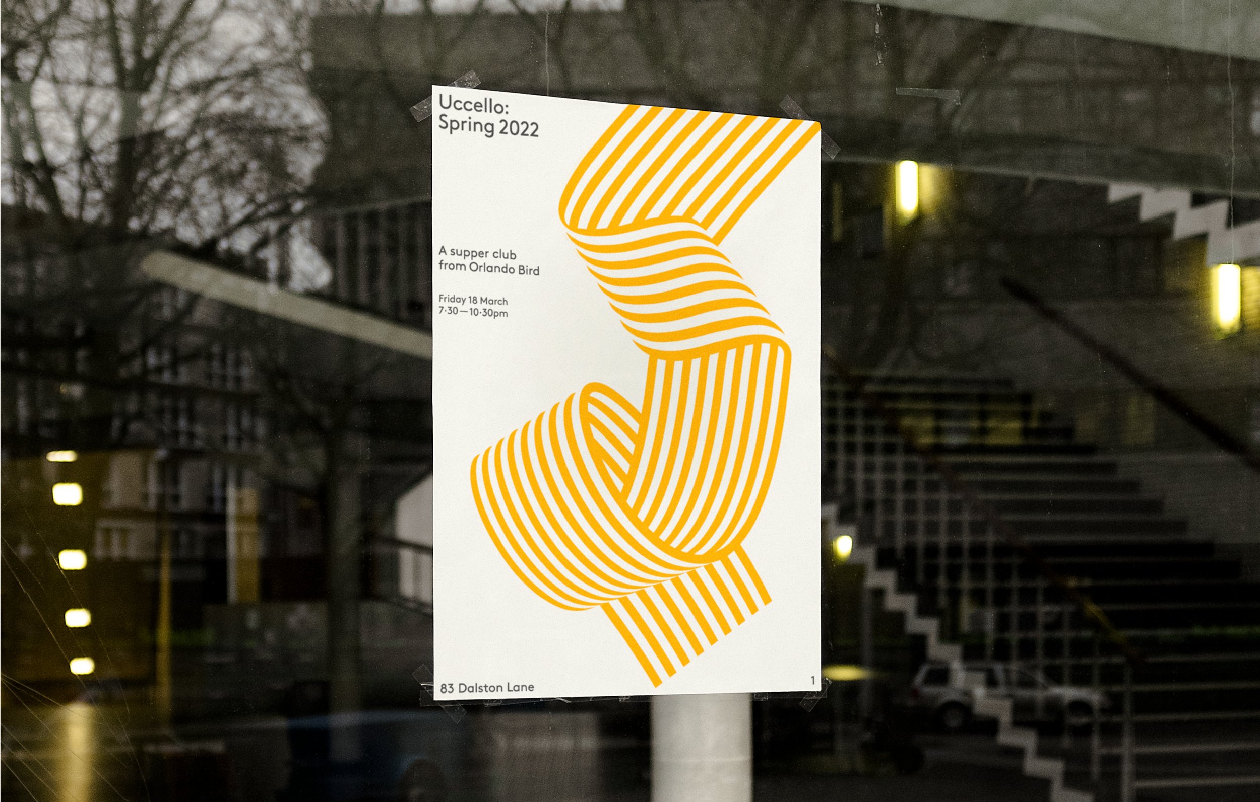
Uccello is a pop-up supper club based in London. The menus combine Italian-inspired recipes with the best seasonal British ingredients and focus around fresh handmade pasta dishes paired with organic, bio-dynamic and natural wines.
The brief was to create a joyful brand identity, communicating a sense of the pleasure that is found in good food and good company. This needed to be executed with confidence, introducing a distinctive new personality to London’s crowded food scene.
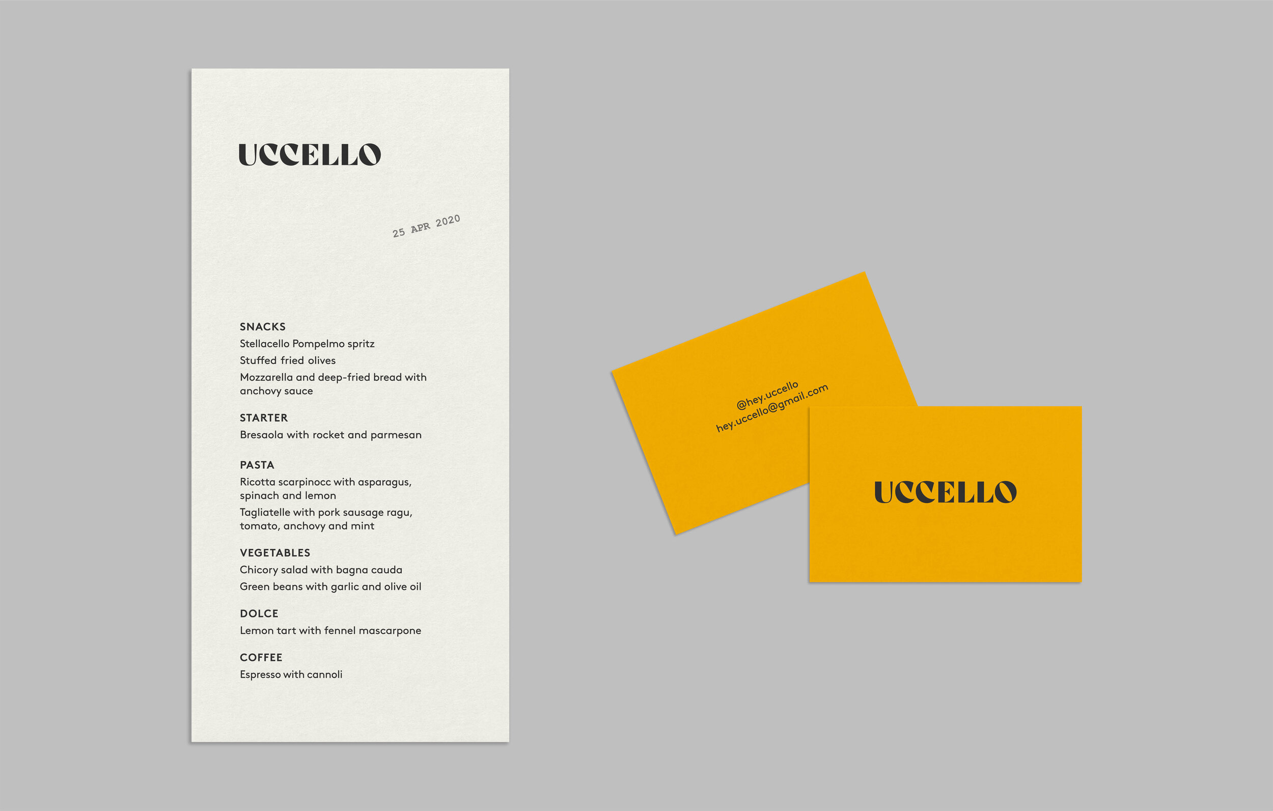
Uccello means ‘bird’ in Italian. The logo is a custom wordmark based on the classic Italian typeface Bodoni. This modern interpretation is expressive and playful with lyrical flourishes that reference both birdsong and the Italian language.


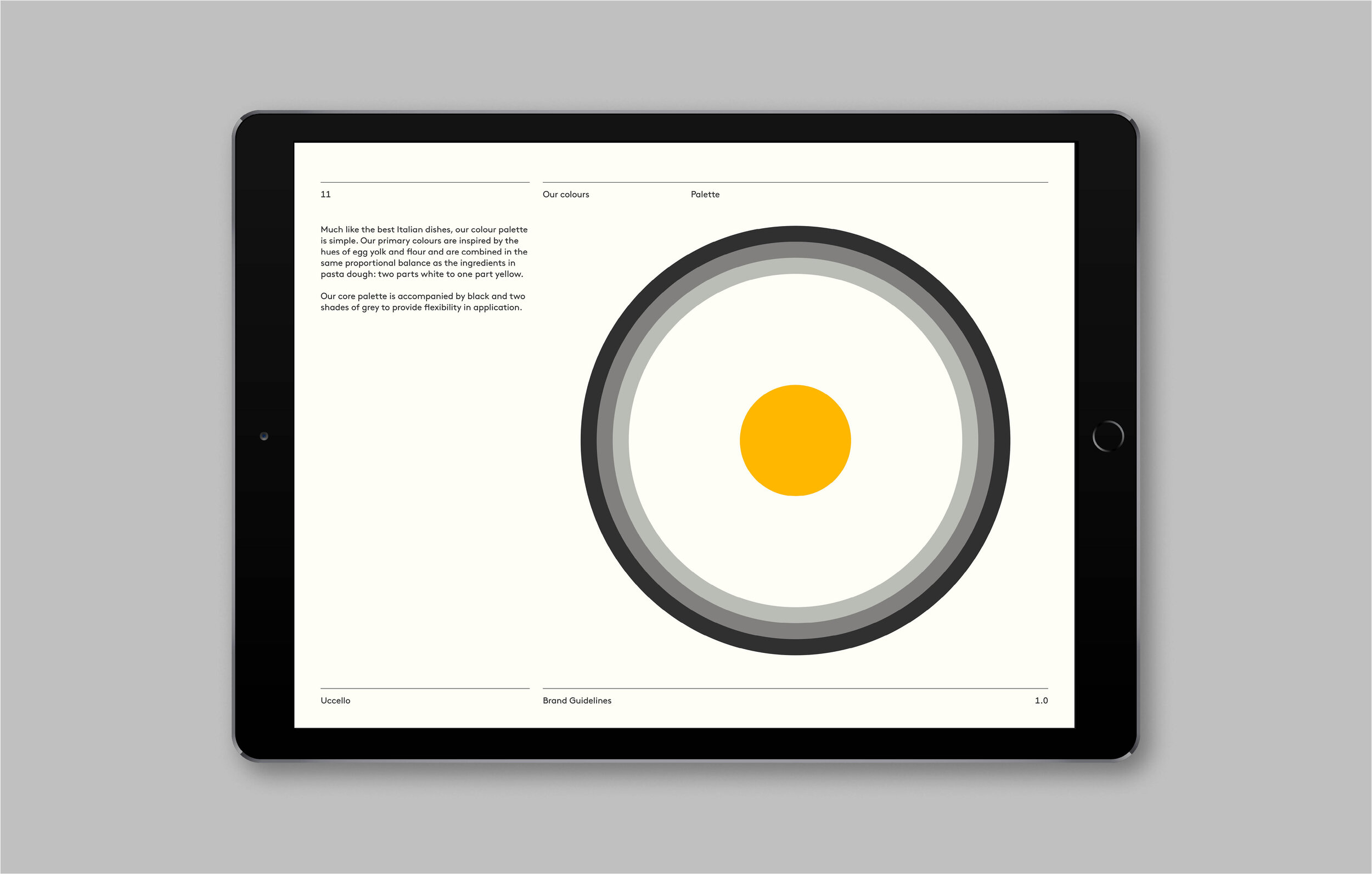
Much like the best Italian dishes, the colour palette is simple. The primary colours are inspired by the hues of egg yolk and flour and are combined in the same proportional balance as the ingredients in pasta dough: two parts white to one part yellow.
This core palette is accompanied by black and two shades of grey to provide flexibility in application.


Uccello’s font family is LL Brown from Lineto, a geometric sans serif with an approachable and friendly feel.


